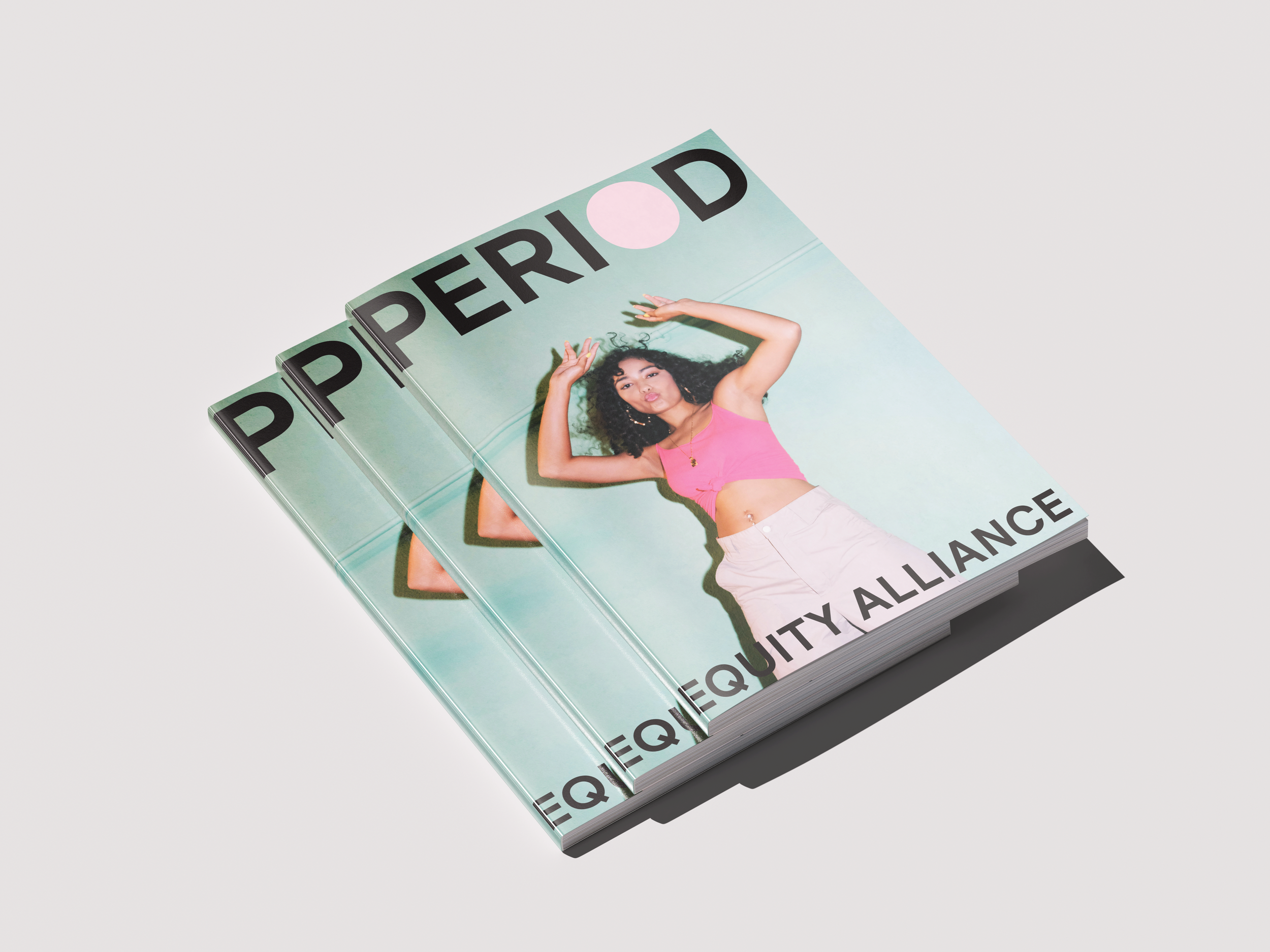
Period Equity Alliance.
Amplifying Voices, Advancing Menstrual Rights.
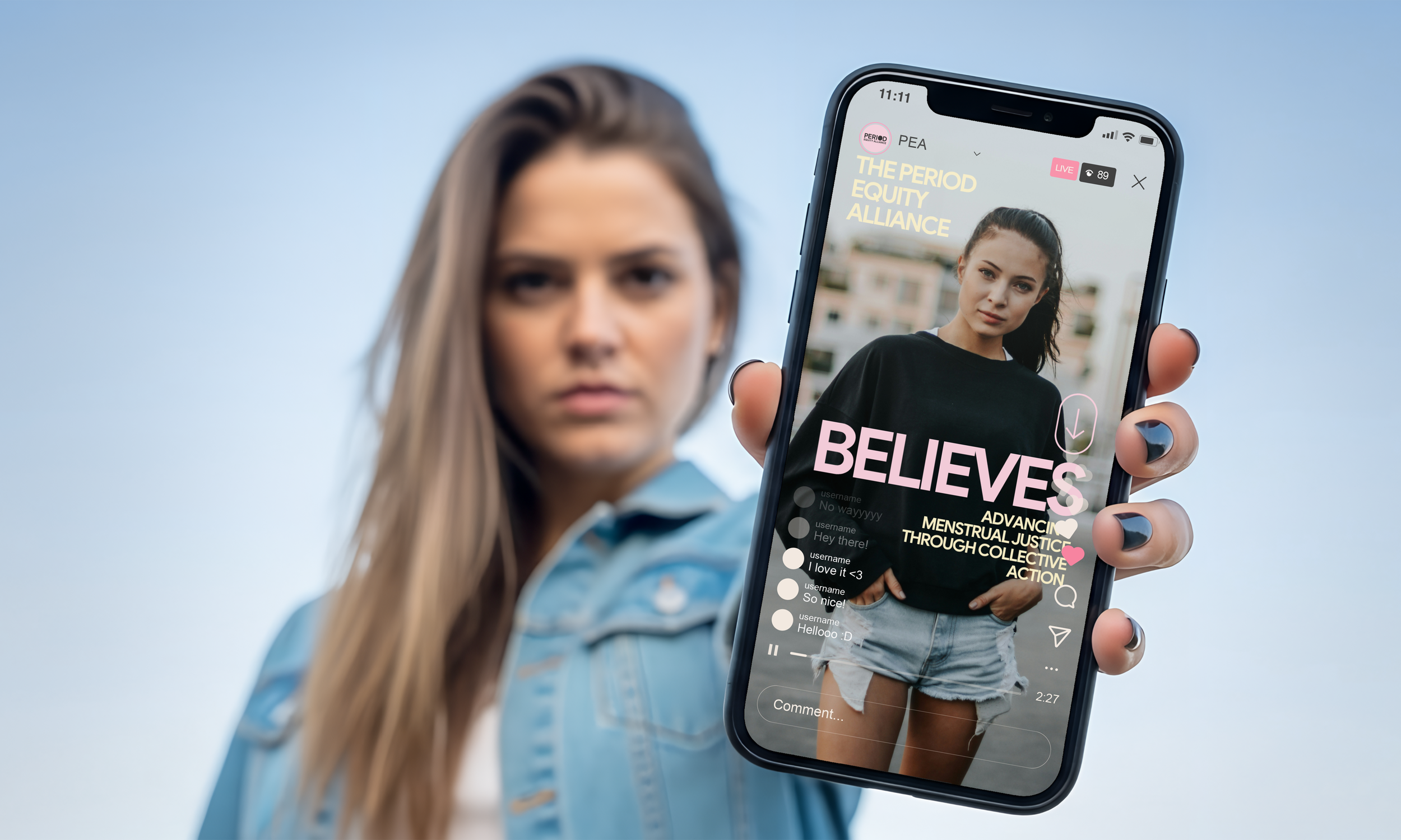
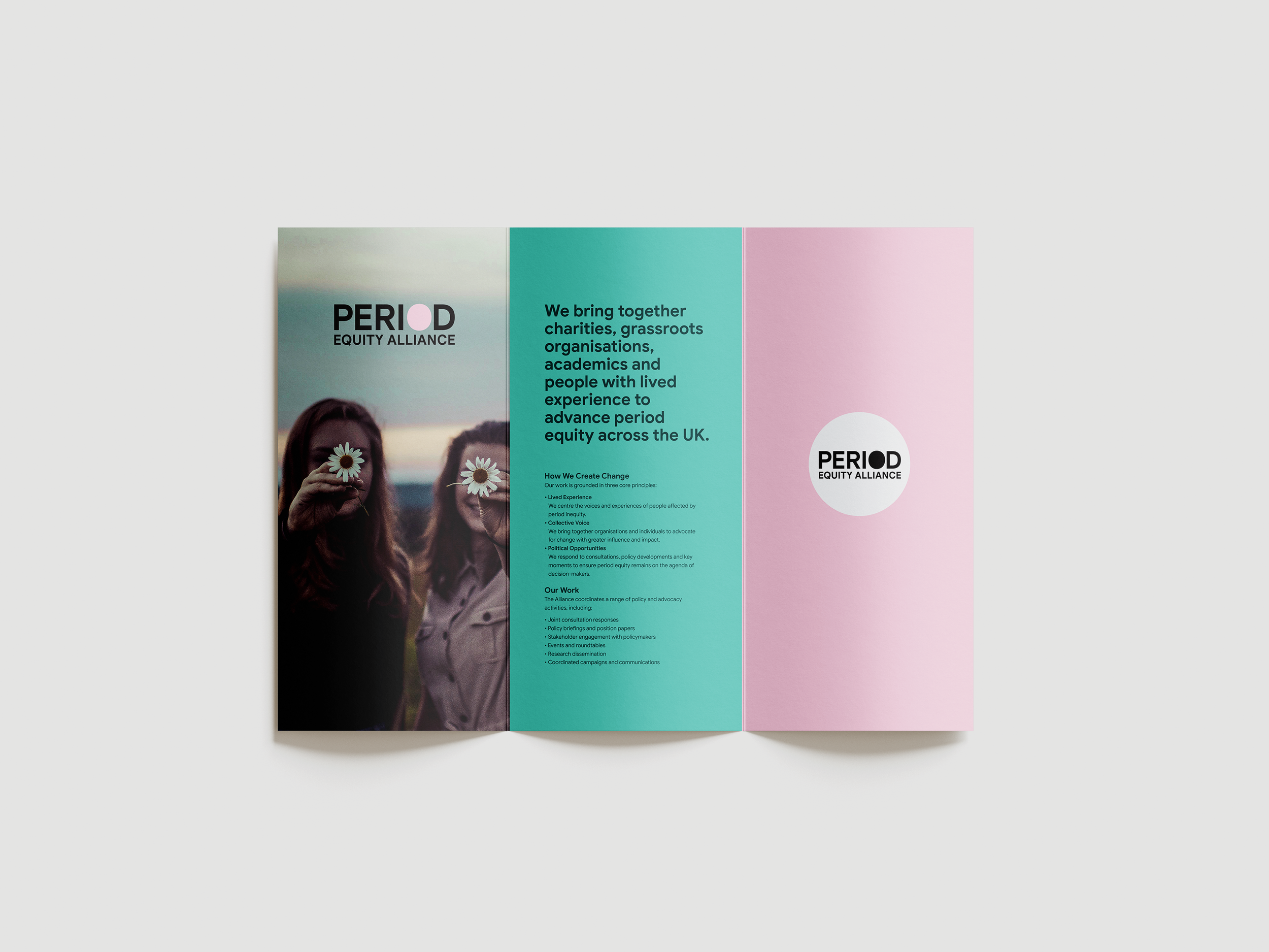
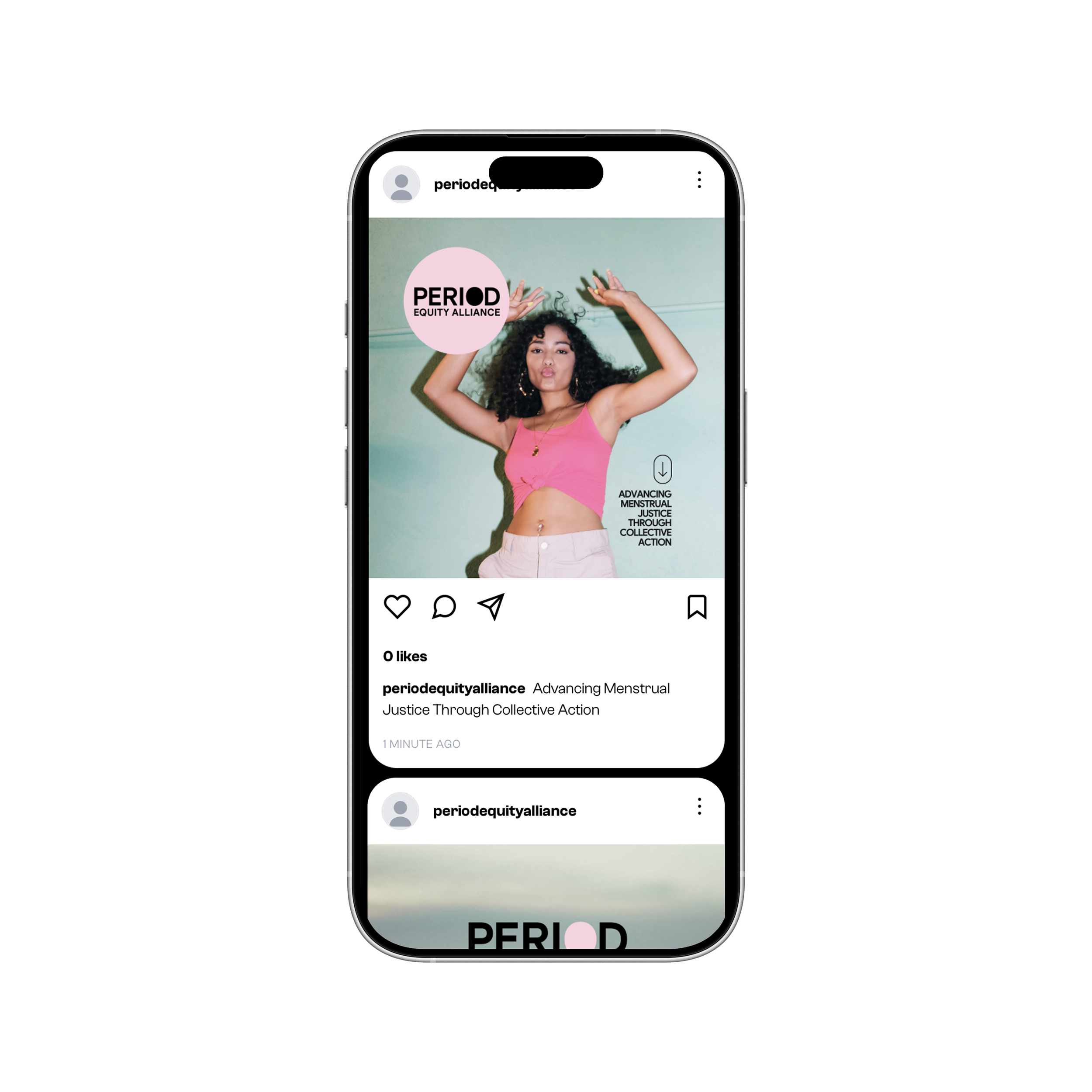
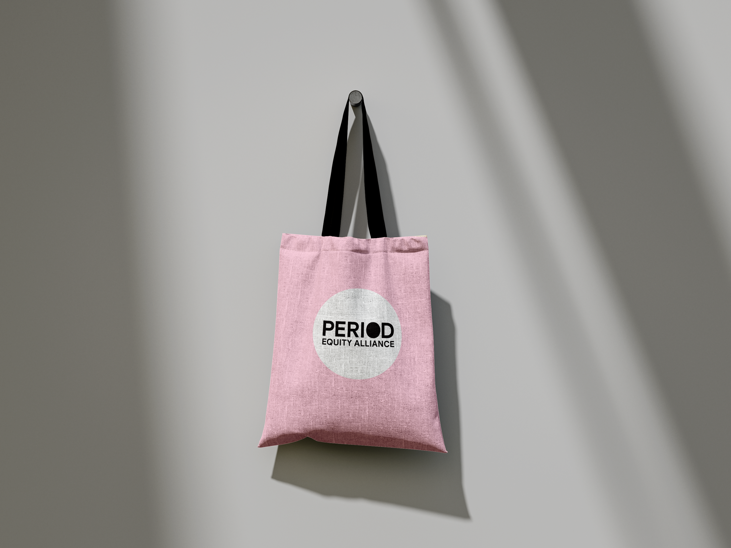
Period Equity Alliance approached us to create a brand identity in a deliberately stripped‑back visual style using confident typography and simple forms.
This was to complement the wider family of contributor brands without competing for attention.
A carefully balanced palette of muted tones was selected, complemented by bolder accent colours to provide contrast and visual impact, allowing the brand to feel approachable and sophisticated, while still offering opportunities for standout moments across different applications.
Branding. Design. Social.